Saturday, November 1, 2025

The Breakfast Club poster

Veronica Fish Breakfast Club alternative movie poster

   Once again, I feel really lucky to be hired to do an alternative movie poster for a personal favorite film, this time, "The Breakfast Club".  It had been a while since I'd done a design with a lot of negative space, so it felt nice to jump back into something that felt almost like a take on a 60s jazz poster.

  I felt that the scene where everybody is dancing would be a good moment to focus on, since their individual dancing styles speak to their personalities, and they are finally united.  I also decided to put a bit of each person's signature color into the others, a symbol of their influences on each other.
The reference material:


"We Are Not Alone" - Karla Devito / The Breakfast Club soundtrack

The dancing scene:


Thanks for reading!

Friday, October 17, 2025

C3P0 painting (for a Star Wars charity thing)


  I did this painting about 10 years ago, for a Skywalker Ranch charity event - and for the life of me I just can't remember what it was!!

  As I rebuild the blog and put the art and process back up, I'd probably need to go to the Internet Archives to try and see exactly what the context was for this, but I just remember a very intense NDA to fill out.

  Anywho, I really loved how this painting turned out!  Acryla gouache on heavy Reeves BFK paper.  

  I wonder who owns it now!

Wednesday, October 15, 2025

"The Fatal Push" Magic the Gathering X Marvel Card art

Veronica Fish Magic Card Gwen Stacy "The Fatal Push"

  Last year I was asked to illustrate a card for Magic The Gathering; the Marvel edition, and was very fortunate to get such a big card.   Many thanks to the art director Sarah Wassell and everybody at Wizards of the Coast for asking me.

 When I worked at a comic shop in my teens, we sold many packs of Magic cards every day, but never really learned how to play it well.  I think we managed a few duels once in a while with friends but I can't even really remember the rules.

   However, the game still retains its popularity, and this is one of a few cards Wizards of the Coast has commissioned. Below is the reference from the scene in the original comic.  I tried a few different camera angles before the art director settled on the above shot.


I hope I get to see one in person someday, I've never seen my art on a Magic card before! 

Monday, October 13, 2025

Shelly / Twin Peaks commission


A commission I'm quite happy with.  Time for a Twin Peaks rewatch since David Lynch is gone...


Thursday, October 9, 2025

Shadow portrait + Austin talk

oil on wood painting, 8"x10", 2006

 A portrait for a patron who lost his dog, Shadow.  When I painted this originally, it had been many years since I knew the sadness of losing a beloved pet.  Years later, when we put Austin down, I really felt what Bob must have been feeling when Shadow died.  It's just absolutely awful.

  Austin made me a dog person, and I'm grateful we had close to 10 years with him. 

Andy and Austin, Adam and Austin


Wednesday, October 8, 2025

The Addams Family poster process


24" x 36" silkscreen on heavy duty paper

  Originally, this group hired to me to illustrate the Addams Family sequel, and sadly I just didn't make the first design work.  My cartoony take on a bizarre camp poster never really took off, and the group kindly let me shift to a different movie all together.

  I just adore this movie, The Addams Family (1991), like The Brady Movie, is able to take the source material and bring the humor to a new level.  This concept went much smoother, I felt like I had a concept and a vision clearly from the start, and was able to get it done relatively quickly.

  The silk screen was printed masterfully, the colors look even better on paper than on the monitor.  There are 3 of these artist prints left (as of publishing tthe addams the addams familyhis blog post) and available on my Big Cartel shop.    >>>   https://veronicafish.bigcartel.com/


Veronica Fish Addams Family poster sketch
and the one we ditched:


Wednesday, October 1, 2025

"Heathers" poster process

Veronica Fish "Heathers" alternative movie poster
   

   When I first saw the movie "Heathers", I was actually terrified.  I'm not sure why, but it took another viewing later on in life for me to fully appreciate its dark humor.  Maybe when you're younger you take things too literally.  

  (And it's not often you see "Veronica" as a main character like that, which is great)

  For a while I was really into images that were trapped within a larger silhouette.  Just before I exhausted myself on that concept, this one popped up in the sketching process and seemed successful to me, given that the visual metaphor is a big part of the film's opening, and isn't just relegated to sight-gag.

  Looking back on these earlier designs, I have to say I actually like them all, and will develop them as well.veronica fish heather's sketchesVeronica Fish "Heathers"

Tuesday, September 30, 2025

"Beetlejuice" poster process work

 I've been hired by different groups throughout the years to take on alternative movie posters, and I'm grateful for the opportunity to make them, especially when the printers used by these groups are so good they make the art sing much more than if it just sat in a digital space.  I can't stress enough how wonderful the quality is on these silk-screens, and I can't recommend printers like VG Kids or Ben Ashton enough - and more companies too, that I will look up and credit here. 

veronica fish Beetlejuice concepts

veronica fish beetlejuice concepts

I like when risks can be taken in these kinds of posters, and the decision to make Beetlejuice implied rather than seen was one of those chances.  I think it turned out well, thanks to the group for letting me do that.

Veronica Fish Beetlejuice poster

I gotta say, it looks stellar in black light!

"Beetlejuice" remains one of my all-time favorite films, for a number of reasons.  

1. I have so much respect for writers who go out on a limb and create an original script with unique characters, that takes real creativity.  

2. The art direction and overall style of the film is so brilliant.  

  Every character speaks dialogue that is so suited to them, you couldn't switch the lines and have the scenes work.  The costuming, lighting, makeup is also specifically made to enhance each scene so well you can understand where the story is even without the sound on.  

3. The foundation of the story and what really brings the film together is the idea of family, and in the end, it's better to try to get along than to despise each other.

And the soundtrack! I wish it came with everything, but some of the most atmospheric Danny Elfman tracks aren't included.  Thankfully some nice internet person makes them available with some minor digging.


♪ Here is a link to a-difficult-to-find track: The Afterlife


Monday, September 29, 2025

"Wednesday" (TV show) poster process

Here's a look at the process for another silk-screen completed in 2024.  We actually don't have Netflix, so I had to  work around it and do research via YouTube and Daily Motion.  The results:

Wednesday TV show poster sketches

Wednesday TV show poster sketches

The group went with C, and I was happy about it although I thought for sure they would go with the famous dance scene (B.)  The printer also had glow-in-the-dark ink available, so the final has some really fun hidden bits that are revealed in the dark...


the final result, 8 color silk-screen on heavy duty 24"x36" archival paper


the purple giclee color variant

..............................................

Jenna Ortega's "The Cramps"/ GooGooMuck dance:


Saturday, September 27, 2025

"Hocus Pocus" poster process + Salem talk

Veronica Fish "Hocus Pocus" alternative movie poster

The "Hocus Pocus" glow-in-the-dark alternative movie poster I created for the 30th anniversary of the movie.  24"x 36" silk screen on heavy archival paper.

Veronica Fish "Hocus Pocus" alternative movie poster

  Early sketches


Veronica Fish "Hocus Pocus" alternative movie poster

Veronica Fish "Hocus Pocus" alternative movie poster

Veronica Fish "Hocus Pocus" alternative movie poster


This piece also has a glow-in-the-dark ink layer, to reveal some cool secret runes.  
The Black Flame candle also glows, the title, the book's eye and snakes.
(You can faintly see it above.)

The print quality on these silk screens is even better in person, the phone doesn't really capture the glow!  The printing people did an absolutely stellar job.

  color variant giclee available


  Hocus Pocus had many filming locations in Salem, and during the wedding we took a group tour by a few of the houses and streets.

  We used to go there a lot about 10 years ago, when the boys were younger, to enjoy the kitch and spookiness.  It's pretty crowded now, definitely not the same, and I miss the days of exploring in the quiet mist. 

  I also remember the fun we had, Andy and I and our friends Brit and Alison, teaching a workshop at the Peabody Essex Museum as well as a program at the Marblehead school, heading into Salem to have some Thai food late at night.


Max's house on Ocean Ave.


Pioneer Village


Ropes Mansion


Philip's Elementary School


Town Hall Halloween Party


Old Burial Hill

...................................


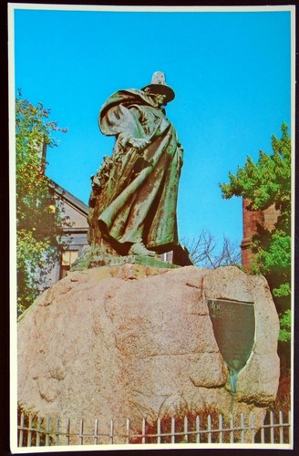
Roger Conant, founder of Salem, MA

  I recently found out that one of my ancestors (direct, too, which is pretty cool) was Roger Conant, the settler and governor of Salem, Massachusetts.  

  No, he had nothing to do with the Salem Witch Trials and according to a book I read about the region Conant was an even-handed, cool-headed guy that stood up for people that needed it and got the early families through the toughest winters.  Later, Miles Standish tried to exile a fisherman for gruffness and excess swearing, and Conant went to bat for the guy in court, telling Standish to back off, and wound up being exiled himself to Cape Ann (which he eventually turned into a successful cod fishing village none the less.) 

  Conant was a moderate Protestant, distrusted by the rather unaccommodating Puritans. He was famous for calmly arbitrating feuds.

  When we were in Salem last year for my stepson's wedding, we got to see an early house my family lived in on Chestnut Street, the first "planned" street in America.  In those days it was expensive having windows, and houses were even taxed PER window!  So many families boarded a few up or made them half-size to avoid the excessive fees.

Of course, it's nice to feel these ties to Salem even in my comic book work, like getting to draw Sabrina the Teenage Witch, and illustrating Salem the cat.  

......................................................

  It's fall now, and looking out the window each day, seeing the trees slowly turn all bright orangey and red, fills the heart with happiness and maybe a bit of melancholy.  I don't know why, probably because it's easy to imagine the way the dog used to sit out there in the sun, the leaves coming down around him.

Austin and Andy, Oct. 2024

Friday, September 26, 2025

"Grim" cover art process: The End / The Tower

  I've decided to put more effort into keeping up with this blog.  Why?  I don't know!  But here we are.  I had saved in a desktop folder progress shots of many illustrations, and now it's been long enough these have been published for a while.  Nevertheless, it's fun to go back and see how everything went.

  BOOM! Studios asked me to create a series of tarot themed covers for their popular series, "Grim", after one that I had done as a San Diego Comic-Con exclusive turned out well, and they were hoping to continue the theme.

  I had a tarot card deck when I was a teen, most likely inspired by visits to a local magic/spell shop in Connecticut and seeing "The Craft" in theaters.  Here is a take on "The Tower" card, since the theme of this issue was serious chaos and destruction:

Grim : The End tarot cover

The End!

The tower card
the inspiration

Grim tarot cover sketch

The little sketch.  Did this on some scrap paper found at my grandparent's retirement home.

Grim : The End tarot original cover art
The finished piece inked on bristol board, 11"x17" with pen and some brush.

  I work digitally so much it's a pleasure to go back to hand-drawn, and yet sometimes not having a consistent set of tools makes inking by hand difficult again.  It's probably smarter to stick with a small set of art tools that are mastered, but that requires a level of focus maybe I just don't have!